
Designing Elytra for macOS Big Sur - Part 1
Big Sur has been the biggest change to macOS since I started using it back during the OS X 10.6 (Snow Leopard) days. We’ve gone from the “hyper aqua” to the subdued and flatter aqua look and finally into the iOS-esque Big Sur design language.
In part 1, we’ll go through the app’s interface from top to bottom, left to right. So as is the case, let’s begin with the toolbar.
Toolbars
In Big Sur, Apple has completely changed the toolbar, not only in terms of its visual design, but also how it behaves, its sizing, allowing content to flow under it (just like iOS' Navigation Bars), monochrome icons and sticky sections.
The new toolbars in some contexts are even invisible. They are part of the content as seen in Photos.app.
Here’s a quick comparison between Elytra for macOS Catalina and macOS Big Sur.
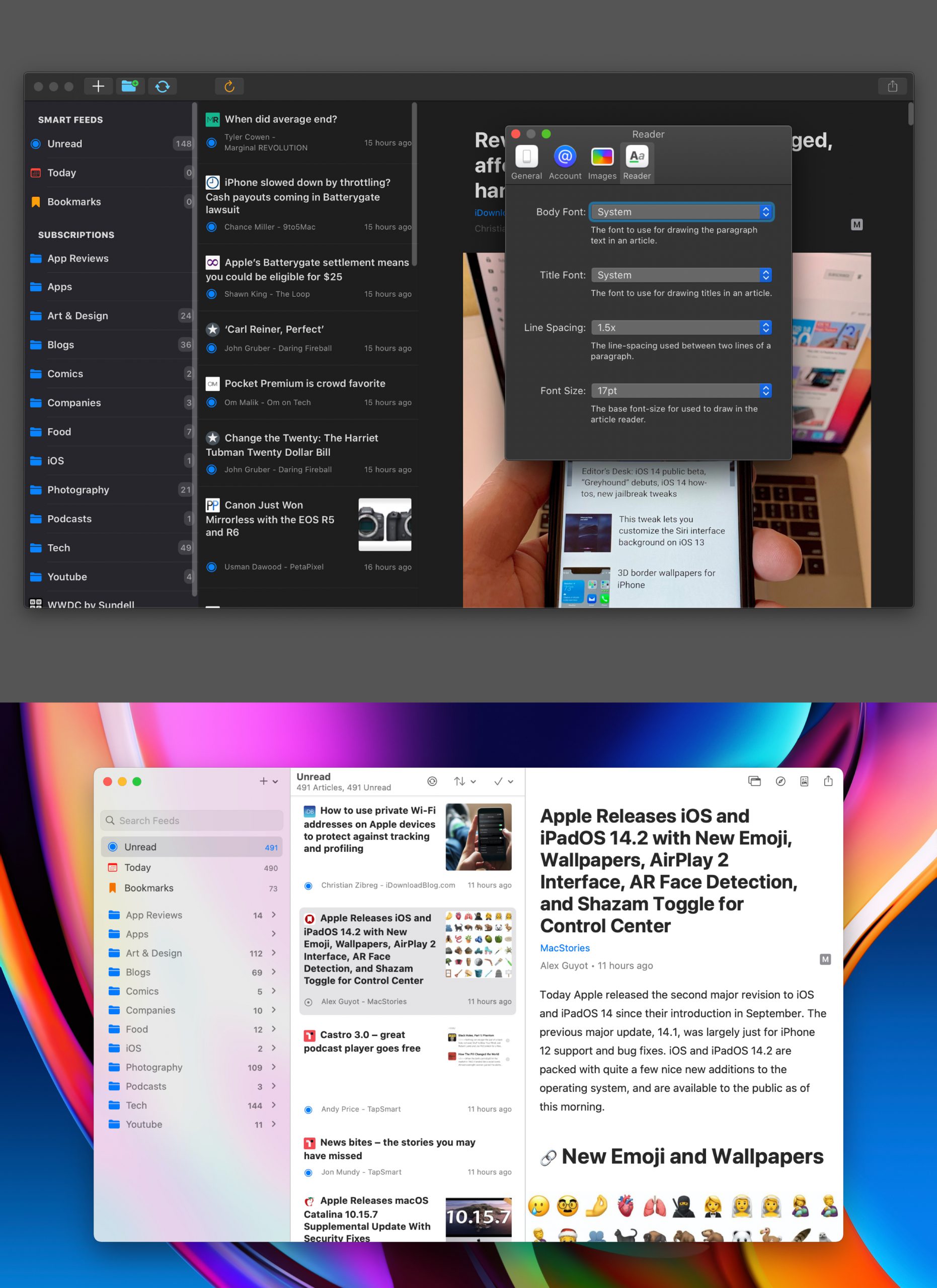
I’ve included fullscreen screenshots on purpose, because Big Sur really enables deferring all UI real-estate to the content if you so desire. In Elytra’s case, an app for reading written content, this was a default choice.
Big Sur also enables pinned or sticky sections for the toolbar, so each vertical column of the app has its own set of actions. While v2.1.3 (first version, odd, I know!) shipped with the toolbar items as you can see, they are definitely set to change in an upcoming release to bring more powerful features to the app.
With macOS taking care of so many things for me, Mac Catalyst became the obvious choice for Elytra right from the get go.
The Sidebar
Full height column, translucent materials, collapsible sections,searchbars, automatic light and dark states; I could keep going on. The new frameworks supplied by Apple to compose such sidebars have been the best thing since their Compositional Layouts framework. And the new sidebars rely on this Compositional Layouts framework to enable a lot of these things automatically.
They are however not without their faults. They do lack some features which native AppKit apps have but I’m sure they’ll all arrive in due time as Apple Engineers continue to reduce the gap between macOS and iOS, or I switch to using SwiftUI and everything renders natively per host OS.
Articles List
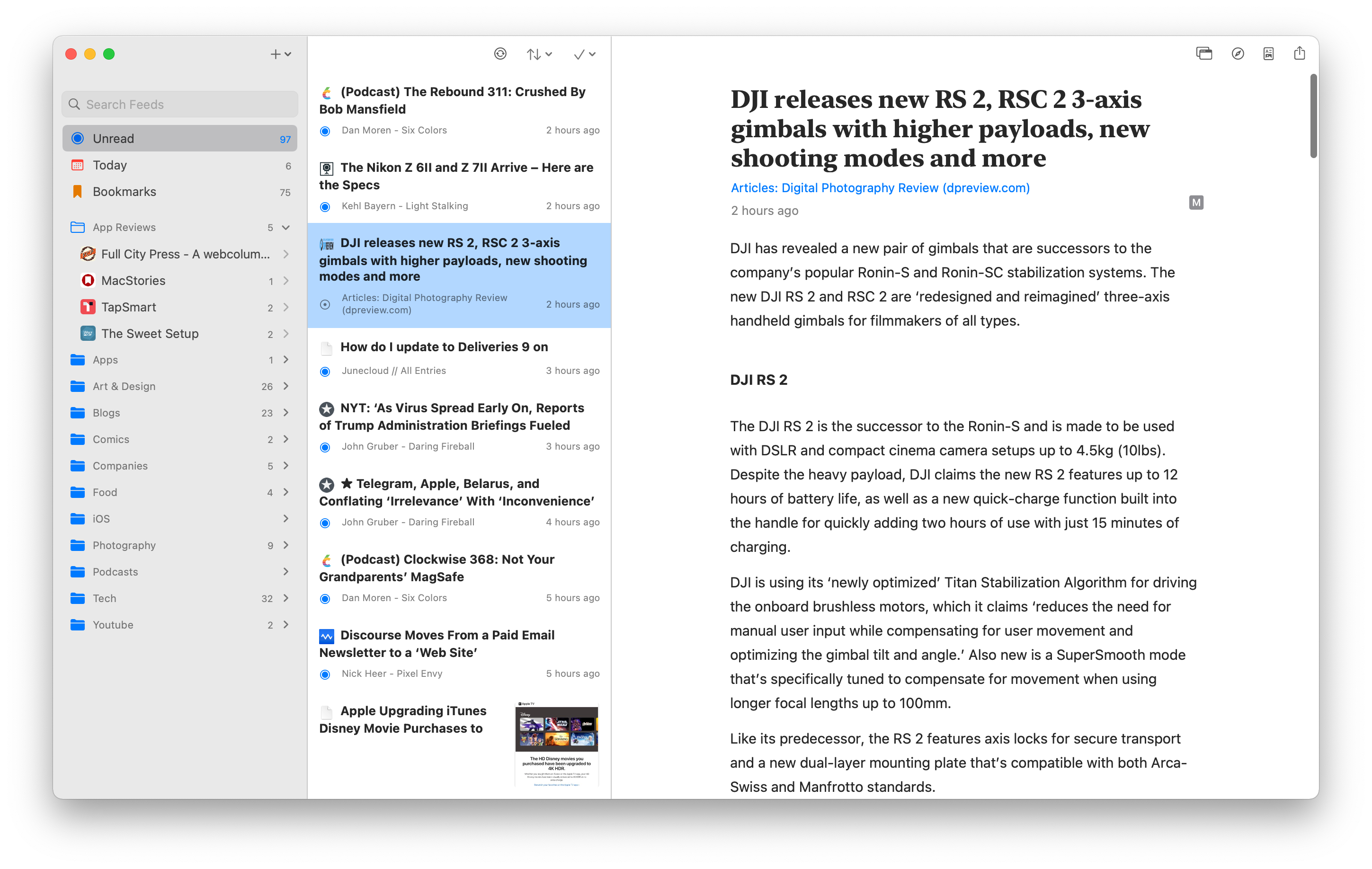
This was a tricky one to get right. Up until late October, this is how the Articles List looked
There are a few reasons why this is completely wrong on macOS.
- The list item completely ignores the new insets which native apps on Big Sur use.
- The list ignores the additional padding required by such lists.
- The list also ignores the inter-cell padding.
All of this is noted by Apple in the “What’s new in macOS” HIG document.
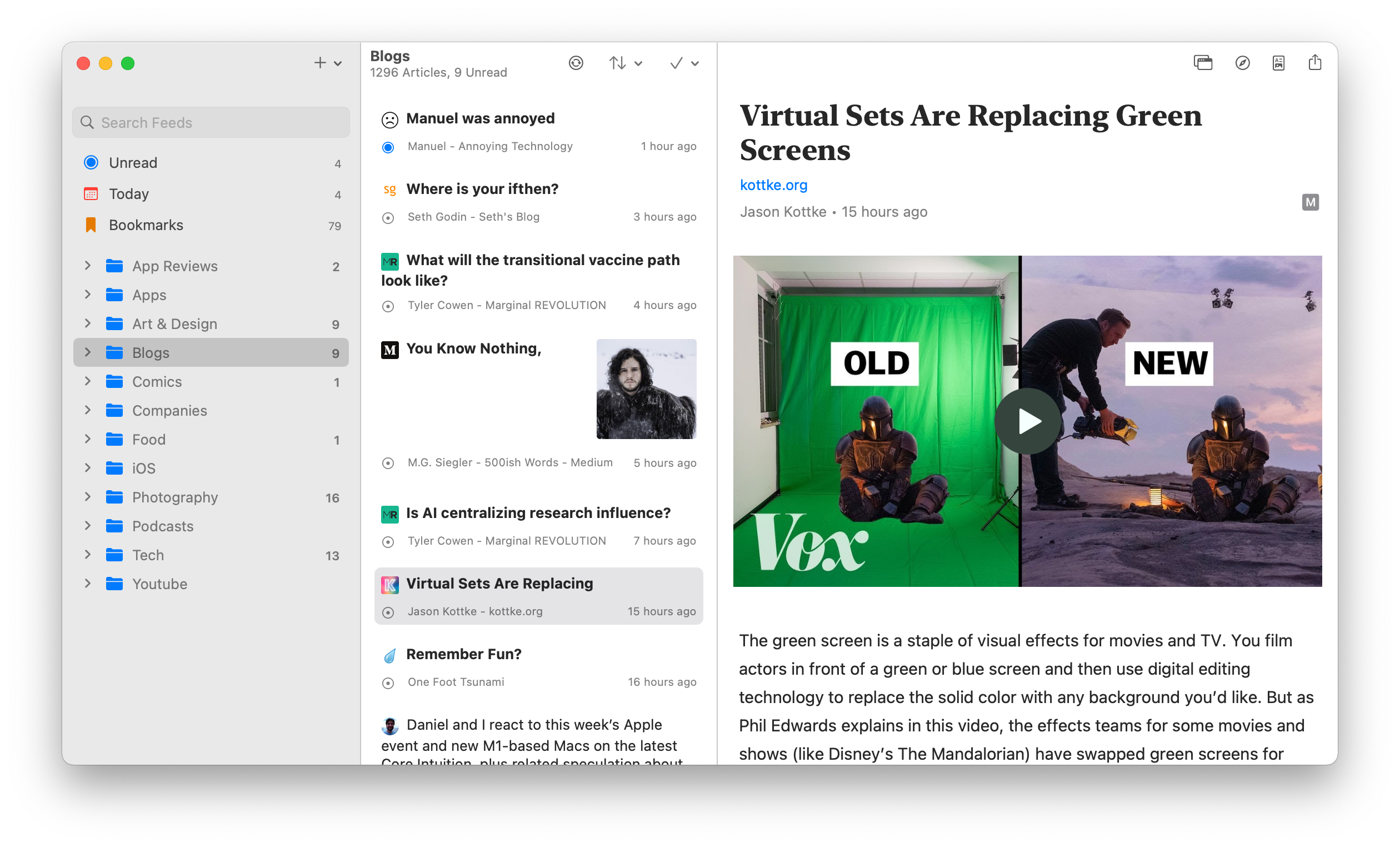
By using Apple’s supplied values, we get a list which is much more comfortable to read and glance at.
So even if you're using Mac Catalyst to bring your iPadOS App to macOS, I urge you spend some time studying the HIG (and not just read it) so you're familiar with what your users are going to expect from your app.
The Article Reader
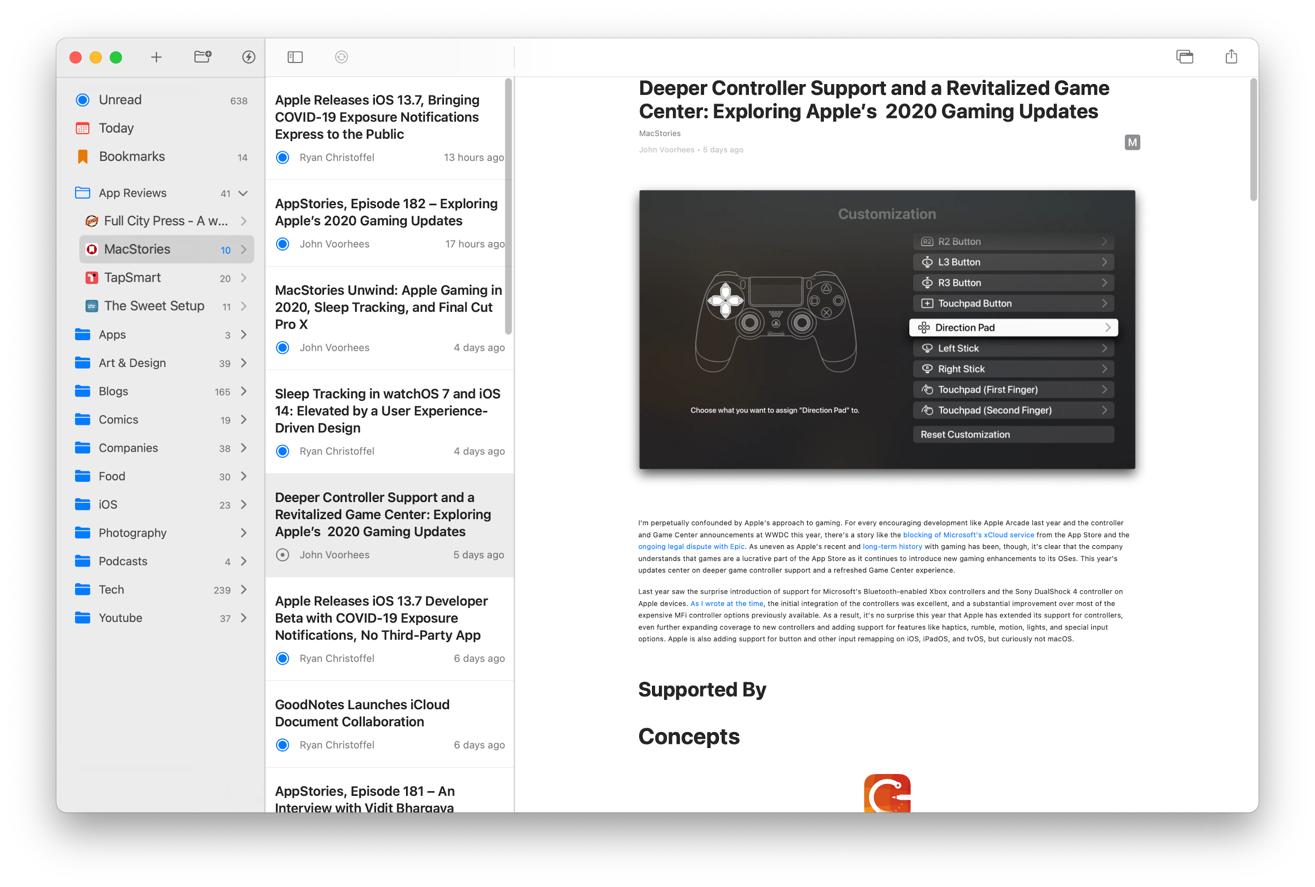
This is what you’re here for. This is why I built Elytra. The article reader in Elytra renders all text using Apple’s TextKit framework, all images directly supplied to UIImageView subclasses, most videos directly supplied to the AVPlayerView, and all code rendered just like text.
Groups of consecutively appearing images are converted into horizontally scrolling galleries with page counters.
Customisation of the reader view by setting up your preferences for font-size, line-spacing, separate header and paragraph fonts.
It’s all there, it all works just as you have come to expect coming from the iOS and iPadOS apps. But it wasn’t as simple as enabling the magical “Optimise for Mac” option in Xcode.
To make sure things work correctly on both iOS and macOS, I had to redo a few bits of the rendering engine to make sure text renders sharp on modern Macs and renders exactly as one would expect it to.
Here’s how the Scale Interface to match iPad variant looked:
Everything was tiny. Everything looked off. Nothing looked like it it deserved to be on macOS. When working on the macOS Catalina build, I used a small hack to scale all type by 1.3x and even that didn’t look all that great.
So to make sure everything is up to the mark and deserving of the Mac-assed Mac App title, I reworked a good chunk of the rendering engine which also ended up benefiting the iOS and iPadOS apps by improving the rendering performance.
I also took the opportunity to enable better rendering for CJK and Indic languages.
In part 1, we looked at the app from a distance, assessed it from left-to-right, went over each column and briefly discussed each section. In part 2, I hope to dig into some technical details of bringing an iPadOS App to macOS via Catalyst.