
New Elytra Landing Page
Elytra’s first website was made in the fall of 2017. It was extremely basic, gave the requiste information to the reader and a link to sign up for the TestFlight beta ( TestFlight Links were not a thing back then).
With the release of v1.0, I updated to an improved layout, more details and screenshots. I kept updating the screenshots up to the release of v1.4 and then completely forgot about it (this did lead to some confusion).
New Website
With the release of v2.0, it was time to update it, however, with the rushed release of iOS 14, I didn’t get enough time to complete it.
Today, I just launched the updated website. Check it out here.
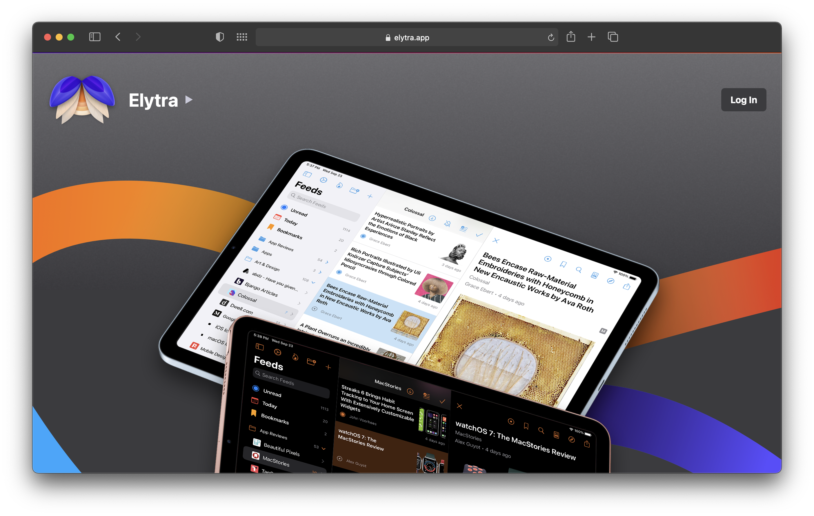
I have simplified the website by much, reduced as many interaction points as possible to ensure the reader can quickly get an idea of the app, and proceed to viewing further details on the App Store.
For the main navigation in the header, I used a simple <details> block with <nav> as its detail block. Accessible, simple, and known interaction.
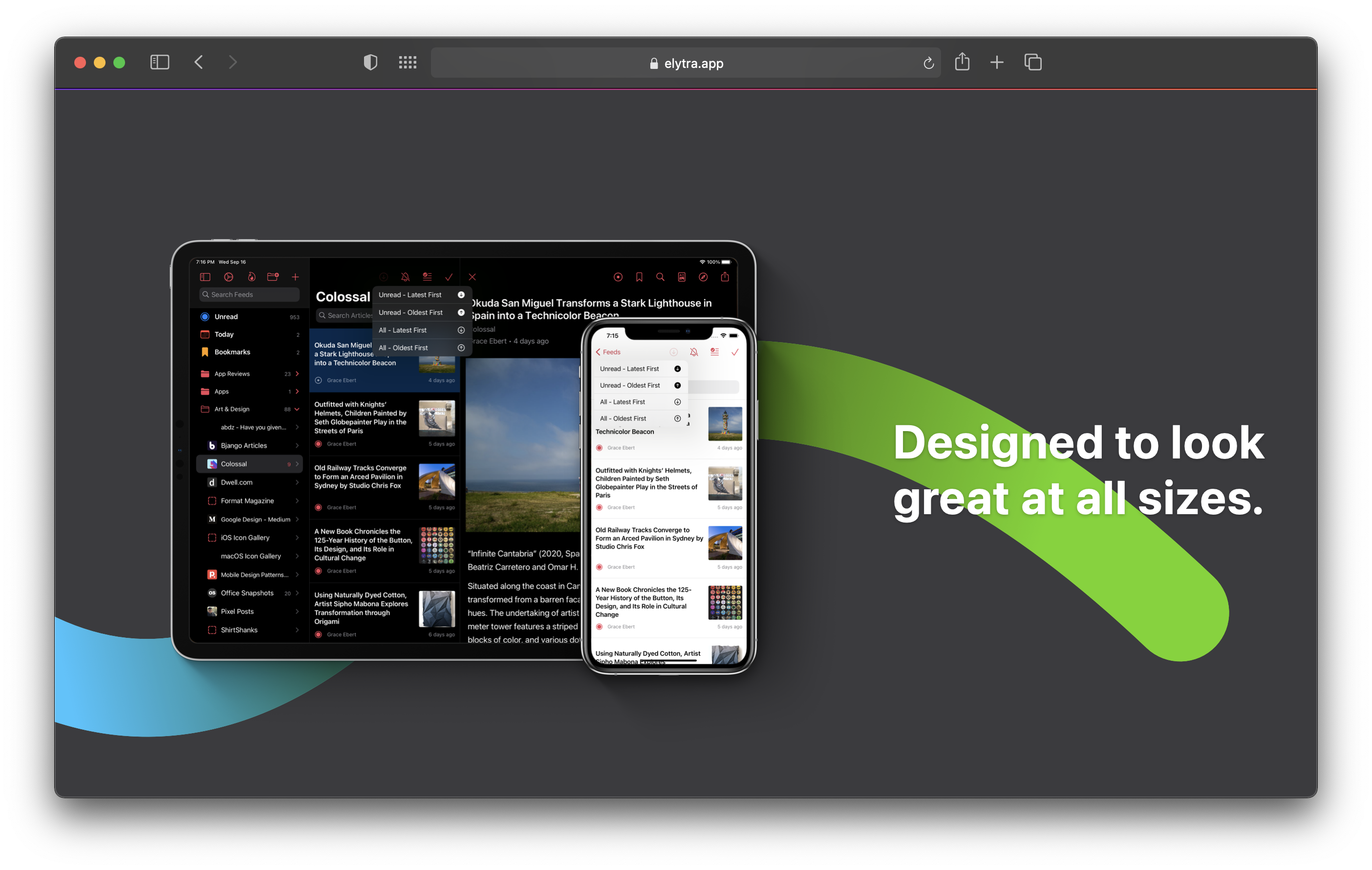
Almost all images are optimised for retina screens as well as for various breakpoints at varying sizes.
One critical section I thought I must add was about Privacy.
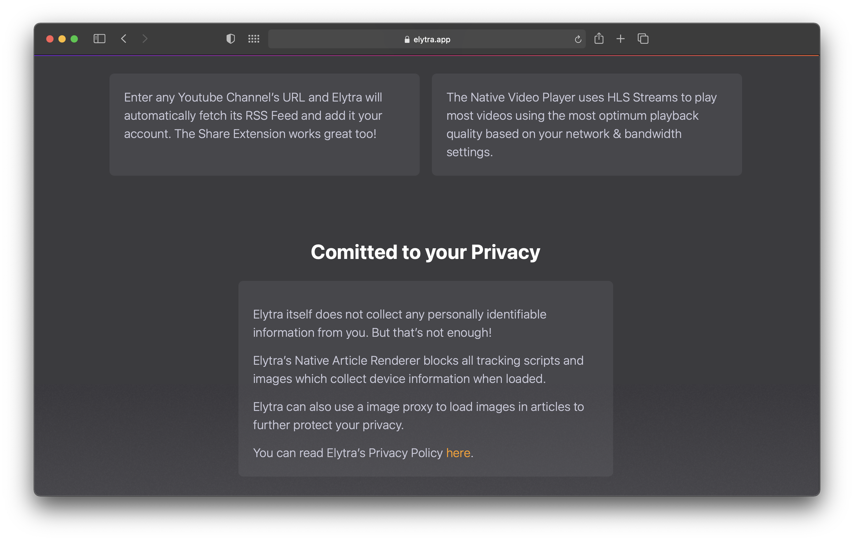
With Apple’s strong focus on Privacy, and a wonderful marketing page to go with it, I thought it would only compliment their message and my committment towards ensuring the same as a 3rd party developer on their platform.
Additional Enhancements
Some additional enhancements I’d like to make sooner than later:
-
I would like to make some tweaks to the font sizes of headers based on the device width metric, but I found it not to be a blocker, and release it as is.
-
Add sRGB and P3 specific images to the sources. When viewing the website on my Macbook Pro, the colours are evidently faded. Since I do have source images in the P3 format, I should be able easily do this.
-
Additional hints for a11y.
Noticeably Missing
Dark/Light mode. The previous website support this, however, for this time around I decided to go with a static colour scheme to suite the various bands I am using on the page as decorative backgrounds for the device images.
This darker colour scheme also strongly compliments the beautiful imagery one experiences when using Elytra with various Photography and Art & Design blogs.
If you have any suggestions for improvements or noticed a bug, do let me know.
As always, happy reading.