Summer 2019 Update
The summer is here (monsoons, for us lucky folks in India) and this brings a new update for Elytra.
Visually, this isn’t a very big update but I have been able to improve a couple of a things in this release which is detailed below:
New
Toolbars
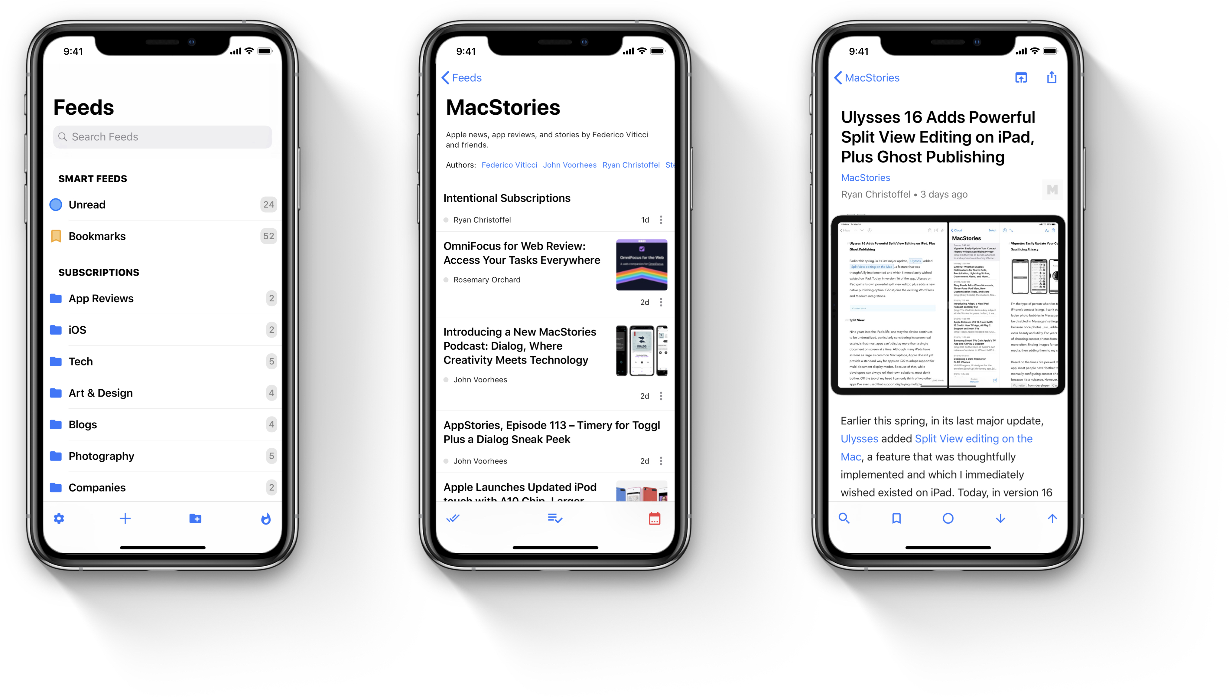
Using the newer longer iPhones becomes a task when handling them with a single hand, especially the iPhone XR and the iPhone XS Max. I personally run into a lot of issues with my iPhone X. These are big devices and reaching actions at the top in the navigation bar becomes a task by itself. So a new option has been introduced in Elytra v1.3 which enables you to bring all of these actions in the toolbar towards the bottom of the screen.


Some actions like sharing an article or opening it in the browser are still left to be in the navigation bar. I hope to enable y’all to determine which actions appear in the toolbar and which appear in the navigation bar in a future release.
Menus
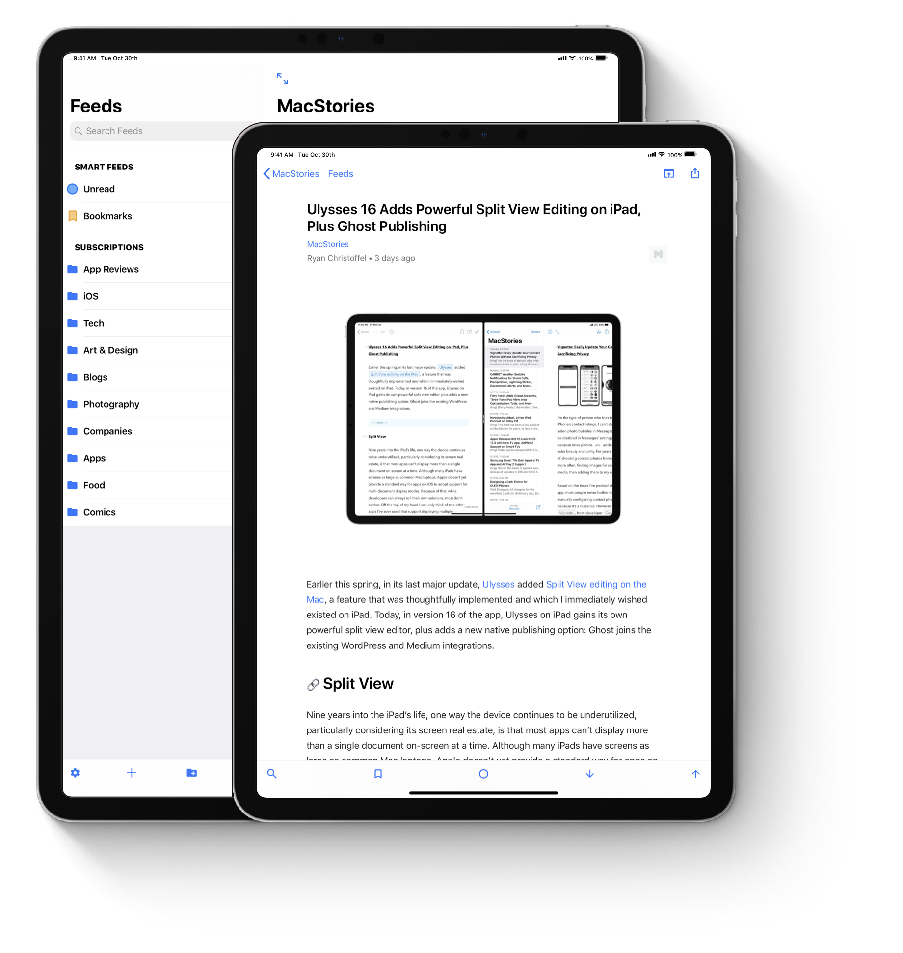
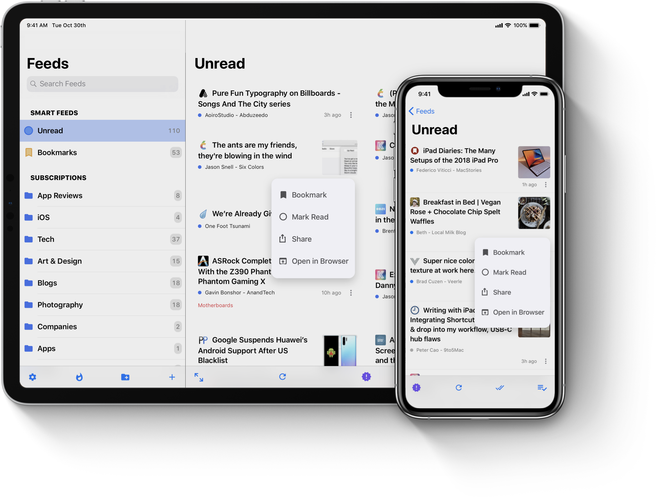
In v1.2 of Elytra, I publicly released the new Extended Layout which was supposed to improve compatibility on iPads and be able to extend the layout to two columns of articles. This was achieved using Collection Views. This introduced a unique problem for me where swipe actions was no longer directly feasible. To address this shortcoming of the app, I’m introducing menus in this release. They bring shortcuts to the Articles interface in Elytra making accessing common actions a little more accessible.

Improvements
Faster Rendering
I’ve reworked certain sections of the Article renderer so I can add more supported sections to the article reader in the future. But the immediate effect of this is improve rendering speeds on older devices like the iPhone 6 and 6S. The performance improvements are huge when compared to the v1.2 builds but don’t take my word for it, if you try it on any of these devices, let me know your experience. You can email me or send me a tweet on twitter.
Another advantage of this change is to bring change logs to the article viewer. I’m working on enabling this so that changes made to an article can be visible so you can see corrections, updates and deletions if you’re interested in that sort of a thing.
Improved Networking
I’ve reworked certain sections of the app to improve networking with Elytra’s sync server. This change is extremely opaque to users but what it does is avoid fetching information it does not need at all. This reduces the amount of data transferred from the sync server and helps save on bandwidth.
Improved Image Rendering
If you start to notice more vibrant images in articles, you got to thank the improvements UIKit Engineers @ Apple have made in iOS 12. As this will be the last version that will support iOS 11 (iOS 13 Betas are either already out or will be out soon), I thought this would be a good opportunity to improve on this. Any images hosted and served by blogs which support the DCI-P3 colour space are now resized according to your specifications while preserving all of that extra colour information.
Fixes
I am very glad to report that v1.2.3 was a very stable build. It reported, for the first time, 0 crashes which is a huge achievement for me and the app. So I have nothing to report here.
Closing Notes
I hope you like this build. I am working on adding a few more smaller improvements and changes through the v1.3 pipeline. Have a great summer and if you’re an iOS or macOS Developer, have a great WWDC!
