The Spring Update
Elytra’s Spring update has been available for a while on the App Store, but due to personal reasons and prior commitments, I was unable to write this post. So let’s get down to it.
To celebrate the Spring Update, I also took the opportunity to update the main website as well. I’ll be making a couple of tweaks to it to fix some responsive design issues, but apart from that, I hope you like it. I also tried making the Privacy aspect of Elytra and the pricing structure (thanks to the wonderful people behind Capsicum app for the inspiration) a bit more clear and upfront.
Version 1.2 has by far been the most involved update I have worked on for any app. On the surface, not a whole lot has changed, but under the User Interface, significant changes have been made to improve rendering times for the Article Viewer, networking, continuous efforts to reduce power and network bandwidth consumption and a whole lot more.
As for the changes directly noticeable, let’s go through them.
What’s New
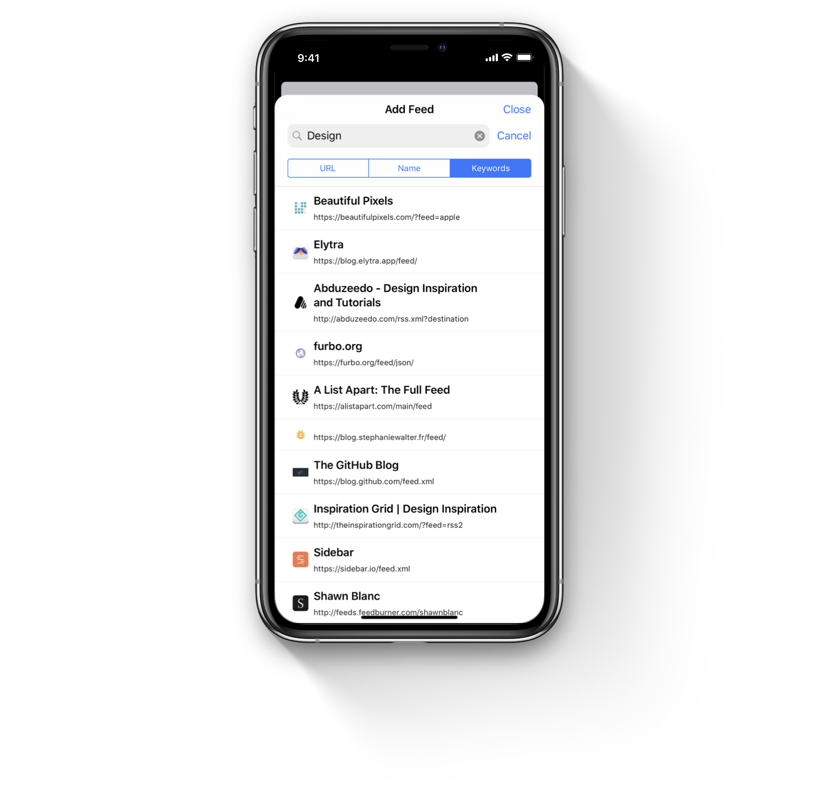
In v1.2, I tried to make finding blogs that match your interests a little simpler. Once again, I did not want to implement a “My interests” based system where Elytra harvests this data and recommends blogs to you. As I noted in my previous post, Improving Discoverability, I harnessed data already available to Elytra to help you find new blogs. You can read all the details in that post.

To further improve upon the same system, adding a new feed now expands to three separate sections:
- The traditional: add by entering a link method.
- Searching by the title of the blog.
- Searching by keywords associated with the blog.
All the information above is made publicly available to Elytra and blogs can change this information anytime. Elytra does not add any information to this so all results you see are Best Match only.
Apart from this, the Extended Feed Format is now default and the older list format has been removed from the app completely. The newer design and layout can accommodate a lot more information and a variety of settings to show and hide that information with better compatibility. I highly recommend you check out the Miscellaneous section under the App’s Settings for all possible options.
What’s Improved
Apart from what I mentioned earlier in the post, there aren’t a whole lot of improvements in the app that are visible. Most changes have occurred “under the hood” to improve performance and stability of the app.
Apart from all the new things and improvements, I was able to fix a lot of bugs from v1.0 and v1.1. As of right now, Elytra has no crashing bugs that I am aware of. This brings it to a level of stability that gives me free time to build other cool stuff for Elytra.
I have one more patch update Waiting for Review in the App Store which will bring the highly requested Reader and Flutter (flatter, but wings, so flutter) App Icon options for you to choose from, so I hope you like them.
Closing Notes
After the release of v1.2.2, if any bugs come up, I’ll be patching and fixing them in v1.2.3. But if nothing comes up, I’ll commence work on a few other related projects and v1.3 in March. As always, I really appreciate the wonderful reviews y’all write on the App Store and I enjoy reading your emails, so please keep ‘em coming. Cheers.
